
Q&A with Carrie Brickell: The woman responsible for WIT’s awesome new look
WIT launched a new website and visual rebrand a little over a year ago. To achieve a striking new look for WIT, the team at the General Design Company led by Soung Wiser got to know WIT by coming to shows, attending Improv for All workshops, and meeting extensively with WIT staff. Since the brand launch, designer Carrie Brickell has been in charge of creating new looks for each of WIT’s shows including FIST, WIT Attacks!, Seasonal Disorder, and Harold Night. We got to talk to Carrie about taking WIT on as a client and how she approached us as a project.
What first got you started working in design?
Growing up, I always wanted to be an artist. In college, I always wanted to eat. A career in graphic design is a rare opportunity to do both!
In all seriousness, when I was deciding on a major, I was torn between graphic design and German. I think I just like to communicate.
You helped WIT in our re-branding recently, what was this process like for you? Tell us about the finished product and how you got there.
 WIT’s rebrand was easily one of my favorite projects. None of us knew the first thing about longform improv and the more we learned, the more we realized you guys are totally bonkers. There are so many moving parts, unexpected changes and variables to what you do. Keeping the identity flexible was key.
The logo itself had to play nicely with the design of every future show, program and class while still communicating the unconventional energy of WIT. In other words, it had to be low-key quirky.
Our solution was a series of overlapping color-coded circles, each representing one branch of the organization (shows, classes and WIT@Work). A nice reference to the spotlight without hitting you over the head with it. We also ended up with a sans serif typeface that is clean and friendly, but just a bit weird. Just like WIT.
Along the way, we had a great rapport. We presented the shuffling anagram concept very early on without a clear plan for it. Instead of being confused and alarmed by this, the WIT folks embraced it and now it lives on the home page for everyone to enjoy. [Ed note: Never seen our anagram shuffler before? Head to the homepage and click the “shuffle” button under our name.]
That kind of trust and willingness to let us run with something has been a huge part of what makes this branding project so enjoyable.
You’ve worked on a bunch of visual identities for WIT’s shows. Which ones make you the most proud?
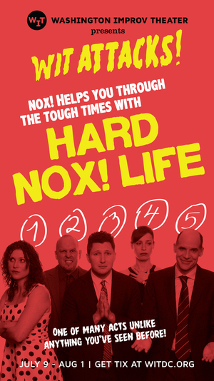 I loved doing the window graphics for WIT ATTACKS! The ensembles were doing such high-concept stuff, like a show based off of Hitchcock’s Rear Window. My job was to marry this b-horror movie aesthetic with the actual concepts for the shows. As a result, they turned out a little more interpretive than usual.
For example, NOX! was doing a show about the five stages of grief, so each ensemble member made a gesture and facial expression personifying one of the steps and I scribbled a number (one through five) in pen over their heads.
So the windows came out looking great and also had some clever meanings behind them if you went to see the show. It’s rare that I get to do something so esoteric, so it was a great project for me.
What has surprised you working with WIT? Are there any qualities that you see design and improv having in common?
I’ve been most impressed with how proficient the WIT staff is with design files. I can hand off design tools and all kinds of magic happens.
For example, we delivered the FIST 2015 logo and WIT’s internal team got it embroidered onto red sweatband cuffs. There was even a cardboard cutout in the lobby for audience members to pose with. I’d love to say I had something to do with that, but it wasn’t me!
As for design how design relates to improv, I’d say teamwork and supporting each other is key. We do our best work when we build off of each other’s ideas instead of rejecting them outright on the grounds that those ideas would be too challenging.
We back each other up in client meetings and help articulate our shared vision. Being in front of a client is like being in front of an audience, so it’s important that we have confidence in each other.
Since you started working with WIT, you’ve seen a ton of shows. Which ones have you enjoyed the most?
 As a feminist and a human person who likes to laugh, The October Issue really stood out to me. During the branding phase, Jaci Pulice was clear that this was to be a loving homage to the women’s magazine industry, not a parody, and I think that showed in their delivery.
They invited prominent women in DC from all different industries to be guests for an on-stage interview, which was very cool. They also managed to be funny about the contents of one woman’s clutch wallet for something like half an hour. Not even a purse. Do you have any idea how small a clutch is? Not a lot to work with. It was masterful.
What was the last thing that made you laugh out loud?
Off the top of my head, I am going to guess it was a tweet by Kanye West. That man is so wacky and the response to his wackiness makes it even better.
As a medium, the jokes on Twitter happen at lightning speed and with so few words. These people are fast and clever. It’s such a great place to go to watch a meme unfold in real time.
So much of the internet is hostile and depressing, but watching people on Twitter just trying to make each other laugh makes me want to hug my screen.
Read more about WIT’s rebrand on Carrie’s website.
If you want to get tickled to high heaven seeing WIT’s performers, come see a show! Check our calendar for the latest listings.
Taking a class at WIT is a great way to meet new people and unleash your creativity. Sign up for a level one class today!